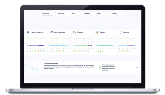
GoalEnvision's magic charts are super efficient and show you in a flash if everything is right. By turning all results into percentages, we can show you several goals at the same time and you can see immediately if you are following the plan or if something needs to be investigated more closely.

A common chart shows the result in absolute numbers. It takes time to understand what the numbers mean and what caused the highs or lows. If you look at several charts at once, it becomes even more difficult to understand how they relate to each other. It can also be difficult to compare charts with very different figures, such as the number of deals per week (2-3) and turnover in kroner (several hundred thousand).
With GoalEnvision's magic chart, you can easily see how things are going in seconds. This is done through charts that show whether the results are better or worse than what you planned for. The charts also show the results as a percentage, making it easier to follow how things are going without having to know everything about which result is displayed. If something isn't going according to plan, you can zoom in on the details to see what needs improvement. Displaying results as relative numbers is beneficial because it shows how well you are performing in relation to your goals.
The benefits of GoalEnvision's Magic Chart:
- Quick overview of whether the results are better or worse than planned.
- The results are shown as a percentage, which makes it easier to follow without detailed knowledge.
- Identify patterns and trends that can help you make better decisions.
- Easily compare multiple charts with different numbers.
- Zoom in on the details to identify what needs improvement.
- Visually easier to understand than traditional charts.
- Easily identify highlights and deviations.
Try GoalEnvision's magic charts now...
The most important thing first; are you following the plan?
Once you have set goals, it is important to follow up and see if you reach them. It can be difficult to know if you are on the right course or not if you only look at numbers and charts. But with GoalEnvision's magic chart, it becomes easier to see if you are following the plan or not.
The diagram shows all the lines in relation to the level of ambition that you set when creating the goal. The ambition level is always 100% in the chart. If you are exactly at 100%, you are following the plan and if the line deviates, you will see it immediately. This is beneficial because it makes it easier to see if you are on the right course or not. If you see that the line deviates, you can address the problem and correct the course before it's too late.

In the example above, there are two goals that have different levels of ambition. The green target has already been achieved to 100%, while the blue target is far from its ambition level. In GoalEnvision, you can click on the blue goal to get more detailed information on how you can work to achieve your level of ambition. This can help you make better decisions and increase your chances of achieving your goals.
Identify patterns and relationships
All the results of the goals are shown in one and the same diagram, so that you can easily see the pattern between the development of different goals. By superimposing different charts and all results are converted to percentages, you see how the development of different goals may have influenced each other.
In the example below, you quickly see that a negative trend in customer satisfaction (green line) a few months ago, has a connection with the declining market share that came a few months later (blue line).

Normalized chart facilitates comparisons
If you want to display multiple targets at the same time to compare them, it can become a problem if you have a large difference on the scales. If e.g. one target's result should show a result between 1 and 10 and another target's result has a scale of several thousands, then the first result will disappear or look like no change has happened. GoalEnvision solves this by normalizing all results so that the scale becomes 1 to 100 as a percentage of the ambition level. In this way, it will be easy to compare small scales with large scales and clearly see all the variations.
Smart filtering: Focus on the most important first.
In GoalEnvision you can display several goals in the same chart. However, if you want to take a closer look at a specific target, it can be difficult to do so if all the targets are displayed at the same time. Therefore, GoalEnvision has a function where you can choose which goals you want to show and which you want to hide. This makes it easier for you to focus on the goals that are most important to you. You can also choose to turn off certain goal results to get a clearer picture of other goal results. This way, you can quickly and easily see how your goals are performing and make decisions based on that information.

Summary:
- GoalEnvision's magic chart shows the result as a percentage for easier comparison and understanding.
- It provides a quick overview of whether the results are better or worse than planned.
- Identify patterns and connections between the development of different goals.
- Normalize all results to facilitate comparisons between different scales.
- Smart filtering makes it easier to focus on the most important goals.


